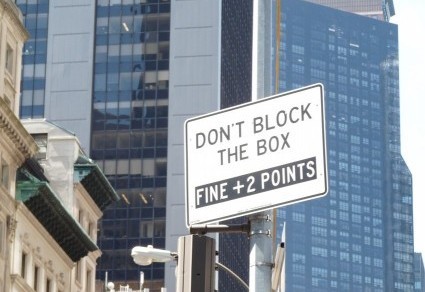
Why are writers so drawn to repetition? Is it the worry that one word won’t get the meaning across? (Maybe that’s why “tense and nervous” is such a popular expression!) Granted, repetition can be beautifully emphatic and reassuring, but these signs go a little too far.
Here’s one I spotted on a restroom door:
I had intended to close door open before reading this sign, but I was persuaded to close door shut instead.
This notice frequently pops up when I’m scrolling through articles classified as “breaking news”:
New updates are so much better than old updates, don’t you think?
Now for a hotel ad:
What’s the difference between a short 5 minute walk and a long 5 minute walk? I’d like Einstein to weigh in on the relativity aspect, but he’s not available. Any physicist reading this post is welcome to offer an explanation.
For more than four years, I was a “Novid” — someone who hadn’t had Covid. Two weeks ago, the little red line finally appeared on my test strip. Feeling not terrible but not great, I spent the short periods of time between naps examining the language of this disease. “I got Covid,” people say, but it seems more accurate to say “Covid got me.” Ditto for “catching”: I wasn’t standing around with a mitt, like a Yankee outfielder. The virus caught me.
As I recovered, I roamed around the Oxford English Dictionary, a word-nerd’s playground. The OED defines “contagious” as “”where the notion of mutual contact is present.” Notion? I didn’t get an idea. I got a sweaty, exhausting experience. Another definition of “contagious” is “charged with the germs of an infectious disease” — as if I’d run up a hefty credit-card bill (crowded subways, theater performances, restaurants) and now had to pay. Fair enough.
This wouldn’t be a proper Grammarian-in-the-City post without a couple of signs. Here’s one from the pre-vaccine era:
Why practicing? It’s not like playing the piano!
Here’s another, same time period:
Nice to know that you can stay on the sidewalk, but your FACE COVERINGIS REQUIRED TO ENTER THE BUILDING. Not sure how FACE COVERING will get there, given the absence of legs, but hey, it’s REQUIRED.
Thankfully, that era is over, though Covid is not. We’ve learned to live with it — actually, to live through it, if we’re lucky. I am, and I’m grateful. I wish you good health!
In my neighborhood, just about every store that isn’t a nail salon is a restaurant. Thus it’s not surprising that enterprising food purveyors do whatever they can to entice customers, including displaying these signs:
The price of one of these LUNCH SPECIALS ($15) isn’t unreasonable in New York City, especially considering that they’re offering WOODFIRED SANDWICHES, which are . . . well, I don’t know what they are. Bread charred by burning branches? Unemployed victims of forest downsizing?
My friend Catherine sent this one:
I had no opportunity to speak with the SANDWITCH, who I assume was selling a consultation lasting as long as it takes to drink a cup of FREE COFFEE. If I had, I would have asked about the accuracy of the spells in Harry Potter as well as the rationale for enclosing FREE COFFEE in quotation marks. Perhaps the brew isn’t actually COFFEE?
I should note that the prices listed below have increased since I snapped the photo:
Inflation or not, who could resist an offer to DESIGNED YOUR OWN SALAD? Also, 16 oz (ounces) equals one pound. Thus the restaurant is offering a one-, two-, or three-pound salad, each with 1 meat and unlimited vege. I must ask: Who has room for much (many?) vege after eating three pounds of DESIGNED SALAD?
Last one:
If Mom gets Fri, who gets all the other days? I’m a Mom, but I prefer Tuesdays. Can non-Moms get the LUNCH Special on Fri?
My advice is to choose a restaurant carefully, eat well, and in the spirit of today’s MLK holiday, find a way to work for a more just world.
For a city well-supplied with public transportation, New York devotes a large amount of signage to parking. I won’t post the ordinary this-is-when-you-get-towed signs (too boring, also sometimes inaccurate). Nor will I dip into history, such as former Mayor Ed Koch’s early 80s “Don’t Even Think About Parking Here” campaign. Instead, I’ll focus on weird elements of the genre I’ve seen recently, such as this one:
Every time I walk past this Garage, I wonder why someone felt the need to insert Temporarily. If the Garage is permanently Full, wouldn’t the sign say “Residents Only” or “Private Parking”? Also, does the sign writer think anything in life is permanent? I certainly don’t, least of all a parking spot in the crowded borough of Manhattan.
Here’s a sign posted next to a train station:
As I read it, you get FREE PARKING on all SUNDAYS & HOLIDAYS, but on only one measly SATURDAY — ever! My advice is to choose your day wisely. You don’t want to blow your free-Saturday card on a ten-minute errand.
Parking signs, by the way, presume a public that actually cares. In New York, that’s not always the case:
It’s a bit fuzzy, so I’ll reproduce the words on the sign next to the car blocking a building entrance: DO NOT BLOCK BUILDING ENTRANCE.
Not only cars bring out NYC rebellion:
Notice all the bicycles neatly lined up in the NO BICYCLES enclosure.
One more:
You can’t go wrong at this intersection. You can’t go right, either, but as I established with the previous two photos, New Yorkers don’t care.
This sign popped up between Delta and Omicron (Pandemic Standard Time):
I get the exhilaration of this business and many others as they celebrated the return of walk-in customers. I’m not sure I get why this shop is back open — either word alone would deliver the message — but I won’t quibble. Joy all around.
I do wonder about signs not related to pandemic restrictions. Why do so many stores feel the need to declare themselves open or closed? Lights on, people inside, door ajar = open. Dim, dusty interior without humans = closed. It’s obvious.
Which is why this sign, spotted by my friend Catherine, puzzles me:
“Good for you,” I thought when I saw this. “I’m happy that you opened. Any plans for what you’re going to do now? Sell something, perhaps?”
This sign was standing near the door of a local restaurant:
“Nice that you opened for LUNCH,” I thought, “but that information doesn’t help me if I want, say, dinner.” I would have gone inside to inquire, but the restaurant was closed. At lunchtime.
Another closing:
I didn’t know a water fountain could be closed, temporarily or not. Then again, I didn’t think you could close this either:
Does Mother Nature know?
My thoughts on this topic are now closed, but I reserve the right to bring them back open.
Holiday season is upon us, so I’m assuming that you, like me, need an antidote to the tension that comes with it. Hence this post of silly signs and light-hearted questions about them.
First up is this earnest appeal:
Questions: Is the sign-poster a fan of knocks or a hater of bells? Is it so difficult to ring the bell that customers have to be warned about attempting to do so? Does anyone attempting to ring the bell fail?
Next is this command, posted on a fence:
Questions: How many people, in a city where theft is not unknown, simply lean or tie their bikes? And how does one post a bike? Why doesn’t the sign mention “park,” “lock,” or “chain” — what bike riders in New York generally do with their vehicles?
Now to the gym:
Questions: What goals could 1 have? To grow up to 2? To find a soulmate and become 11? To add some muscle and reach 10 or 100? And how does one — er, I mean 1 — refine those goals?
Last up is this sign:
Questions: How do you drop off a shoe shine? Can people pick up what they dropped off, or is the shoe (or pair or shoe shine) gone forever? Has there been an increase in shoelessness around this shop?
After enjoying (or at least surviving) your Thanksgiving meal, feel free to send me answers.
How do you judge the quality of something you’re purchasing? By listening to friends’ recommendations, checking online reviews, reading tea leaves? Perhaps you place your trust in signs — not omens, but actual signs, such as this one:
This may be the workplace of a superb tailor, but I object to the phrase one of the best. What does that mean, exactly? One of the best on the block? (That’s likely, as it’s the only tailor on the block.) One of the best in the neighborhood? There might be some argument about that.In the country? The world? The universe? (Hey, if there can be a “Miss Universe,” there can be a “Best Tailor in the Universe,” too.) However vague the claim may be, the store has guaranteed it. It would be interesting to see a dissatisfied customer try to collect!
I had to check the dictionary for this next statement of quality, painted on the side of a van. I usually hide company names when I post signs, but in this case, the name is part of the point.
WE STAND UP TO OUR NAME! When I read this sentence, I pictured someone from the High Definition Cooling Company with hands on hips, defiantly facing the name because . . . well, what does a name have to do to motivate workers to stand up to it? Unable to think of a plausible scenario, I turned to the Oxford English Dictionary for other definitions of stand up to. I found “remain firm in the face of” (stood up to a strong wind), “pass a test” (stood up to close examination), and “rise for a purpose” (stood up to dance). I confess I can’t make any of these definitions work.
Nor do I know what this sign means:
Returning to the OED, I read that uncompromising means “not willing to seek compromise,” “stiff,” “stubborn,” and “unbending.” Okay, the signwriter is touting a style and quality that will not change. But what sort of style and quality does the product have? If it’s an ugly style or a poor quality, most people would prefer a little compromise. I would, and in that spirit, I welcome alternative interpretations of these signs and of the style and quality of this post.
Innumeracy — the mathematical equivalent of illiteracy — is on full display in signs I’ve seen around New York in the last couple of years. Take a look at these:
Notice that Off-Broadway Week is 14 days long and Muji Week runs for 32 days. That’s good news for ticket-buyers and shoppers, but potentially bad news for actors, crew, and other employees. I hope they get paid by the hour, not by the week.
Here’s a sign I spotted on the First Avenue bus:
A note to non-New Yorkers: Manhattan streets are laid out on a numbered grid. The numbers get larger as you travel uptown and smaller as you travel downtown. The photo is a bit fuzzy (snapped on a moving vehicle) so I’ll type out the relevant parts: The stops are 14th Street, 23rd, 34th, 29th, and 42nd. Loopy route or miscalculation? Judging from the ride I took, I can affirm that the latter description, unlike the sign, is correct.
Before you go, check your numeracy by solving a math problem based on this sign:
If Alex and Sasha polish off six, 8 FL OZ servings of this beverage, how many calories does each ingest if Sasha drinks twice as much as Alex?
This is the spot where I should place the answer, upside down so you’re not tempted to peek. That’s beyond my Word Press skills, so I’ll leave you hanging. Post your answer in a comment, and I’ll let you know whether it’s correct. If you have trouble solving the problem, meet me on the uptown bus, somewhere between 34th and 29th Street, and I’ll tell you the answer.
I live in New York City, so irony is my default tone. Thus I’m fairly sympathetic to “scare quotes,” the print version of “air quotes” — punctuation that writers insert to distance themselves from whatever’s inside the quotation marks. The problem is that sometimes readers can’t tell whether the quotation marks indicate a definition (as they do above), an exact rendition of someone else’s words, or an eyeroll. Take this sign, for example:
I’m not sure why NO appears inside quotation marks. If these are scare quotes, the signwriter is saying, “Cyclists, you are not supposed to park here, but [wink wink] you will anyway and I won’t stop you.” It’s also possible that the signwriter may be quoting someone: “Don’t blame me! The owner said NO.” Putting aside the punctuation issue for a moment, I still don’t grasp the intended meaning. Is the sign protecting cyclists (“There’s a HAZARD here for you!”)? Is it trying to safeguard pedestrians, who may trip over a parked bike? Keeping cars and bikes separate? Inviting cyclists to leave their bikes because there’s NO PARKING HAZARD? I can only speculate.
Nor can I determine the function of the quotation marks in this photo, sent by my friend Ellie:
Frankly, I have no idea why quotation marks appear in this sign. Nor do I know why there is an ellipsis (three dots) after flowers. Unfinished thought? An attempt to create suspense? I’d take a scalpel to this sign, excising two dots, both quotation marks, and one exclamation point. Then I’d use the scalpel to cut myself some flowers.
Another sign suffering from excess punctuation:
Here’s what I know for sure: the restaurant needs HELP in the KITCHEN. It also needs HELP in signwriting. The business is seeking a COOK and . . . well, I’m not sure who else. There may be two spots open, one for a DISHWASHER and another for a DELIVERY person. The forward slash in DISHWASHER/DELIVERY implies that one employee is supposed to wash a few pots and then dash out with a DELIVERY. Three exclamation points convey desperation, though perhaps not enough to raise the salary being offered to a potential COOK, DISHWASHER and DELIVERY person. PETER, if you see this post, please clarify. Readers’ theories also welcome!
Can we agree to give up on apostrophes? All together now: pry the key off the computer, excise the concept from your brain, and resolve not to write anything with a curved mark hanging next to a letter. Can you feel the relief? Never again will you have to critique a sign like this one:
This is not my dentist, but if I were in search of a new one, I would not rule out this fellow because the plurals are (gasp) written with apostrophes. Inserting punctuation is not the same as filling a tooth. Besides, apostrophe-less words are perfectly clear, most of the time. Take a look at this helpful sign from a clothing store:
On reflection, not very helpful. The sign is on the ground floor, surrounded by racks and tables displaying tee shirts and shorts for nonhuman life-forms (I can only assume, since the sign indicates that women’s, men’s, kids, and a single, solitary baby are accommodated downstairs). Back to my apostrophe point: If women’s were womens and men’s were mens, would shoppers be any more confused? I do admit that the lack of consistency is problematic. Anti-apostrophists like me could delete two bits of punctuation, and pro-apostrophists could add them. Both groups could pluralize the youngest age group.
This sign is also confusing, not just because of its punctuation:
I can ignore the PUSH / DO NOT PUSH issue, because (a) there’s a pandemic and (b) removing a decal from glass is not fun. What I can’t ignore is the !!! in the middle of a sentence. An exclamation mark is an end point. You get there and you’re done, unless you’re Panic! At The Disco, a band with an internal exclamation point that, perhaps not coincidentally, broke up a few years ago. Also, no one needs three exclamation points, especially now. We’ve had enough excitement for this millennium, thank you very much. Revised, much improved versions: Please DO NOT PUSH THE DOOR! or Please, do not push the door.
Perhaps the previous sign could send two of its exclamation points to the one below, sent by my friend Sean:
I would feel much more comfortable with an exclamation point after hunting. Even two. Much safer for everyone. Speaking of safe: please stay that way. Covid is still out there!