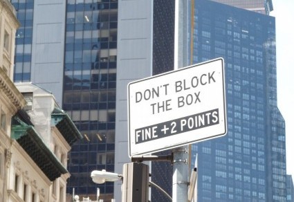
A completely unscientific survey of signs in New York City reveals that very few sign-writers understand the conventions of capitalization. Or perhaps they do, and don’t care. Or maybe the store owners wish to associate themselves with the iMac and iPad, with the hope that unconventional capitalization will lead to the level of success Apple enjoys. Regardless, capital offenses abound.
Some sign-writers opt for all caps:
Nothing wrong with this practice – on signs – though all-caps employed to “shout” in emails and blog comments can be quite annoying.
Other signs strew capital letters randomly:
Notice the “State of the Art Subway Line.” Nothing in Standard English calls for capital letters in those words. Perhaps the sign-writer was excited about the “Second Avenue Subway Project,” which I capitalized, as did the sign-writer, because that’s the name of something, in this case a construction site that was originally scheduled for completion years ago and, contrary to what the sign says, shows no sign of being ready by 2016 – or 2017, for that matter. By the way, in Standard English the word “the” is usually not part of a name and therefore is written in lowercase (non-caps).
One more capital letter sign, on a Fifth Avenue store:
The usual practice is to capitalize the name of important historical eras, such as the Enlightenment (which lasted a century, give or take a few years) or the Middle Ages (which endured for maybe 1000 years). This store apparently believes that their construction work will go on for quite a while and hit the history books, or at least Wikipedia.
Full disclosure: part of this post was originally a separate page in the “Signs of the City” section, which I am slowing dismantling and placing in the “posts” portion of this site. As far too many signs say, sorry for the inconvenience.


Re the all-caps sign: it’s actually been shown (Don’t ask me where, but it has! I swear!) that all-caps text is harder to read than text with upper/lower case. It has something to do with the shape of the letters helping us read/decipher the words much more quickly.
Re the random caps: I used know a fellow who did that in everything he wrote. It was so annoying to look at. And he was soooo stubborn and defensive when I told him it was wrong to do that – plus it didn’t bode well for his credibility (as an insurance broker)!
Sigh. Some people just don’t get it and/or don’t care!
Dear Ellie,
Your comment about all-caps being harder to read, together with your request not to ask for your source, prompted me to turn to Google, which provided me with the following elucidating hit:
.
Thanks for the capital idea. 🙂
Apparently, the web address didn’t print.. To access the website, Google the phrase: Why Text in All Caps is Hard for Users to Read.